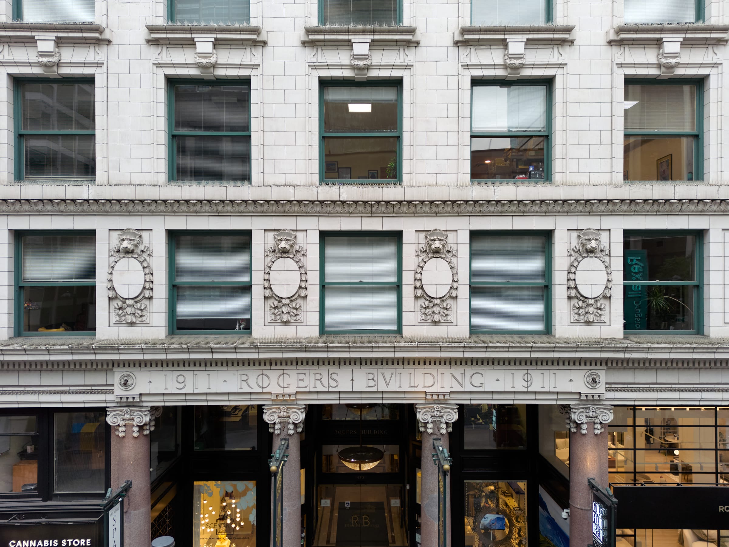
The Rogers Building façade with its carved inscription and lion-head cartouches

Architecture · Gould & Champney · 1911

Of the modern French Renaissance.

An elaborate granite base, a plainer terracotta shaft, and a light classical steel cornice — Beaux-Arts training applied to a boomtown office block.

The Style

Edwardian Commercial, dressed by Paris.

Heritage scholar Edward Mills described the Rogers Building’s design as “of the modern French Renaissance,” reflecting the Beaux-Arts training of architects Augustus Warren Gould and Édouard Frère Champney. Like Gould’s earlier American Savings Bank and Empire Building in Seattle, it composes the façade in three parts: an elaborate ground-floor base, a plainer intermediate shaft, and an elegant, light classical cornice.

Where the Seattle bank used plain Doric columns, the Vancouver building answers with a pair of grand pink granite Ionic columns — with pilasters of the same stone defining the other ground-floor bays. Above, cream glazed terracotta rises eight storeys to a galvanized steel cornice with dentils, egg-and-dart moulding, and lion heads.

The structure behind the skin was the real news in 1911: a steel skeleton with poured concrete infill — “the latest ideas of reinforced concrete construction and the first ten storey of its kind in Canada,” as the Daily Province put it.
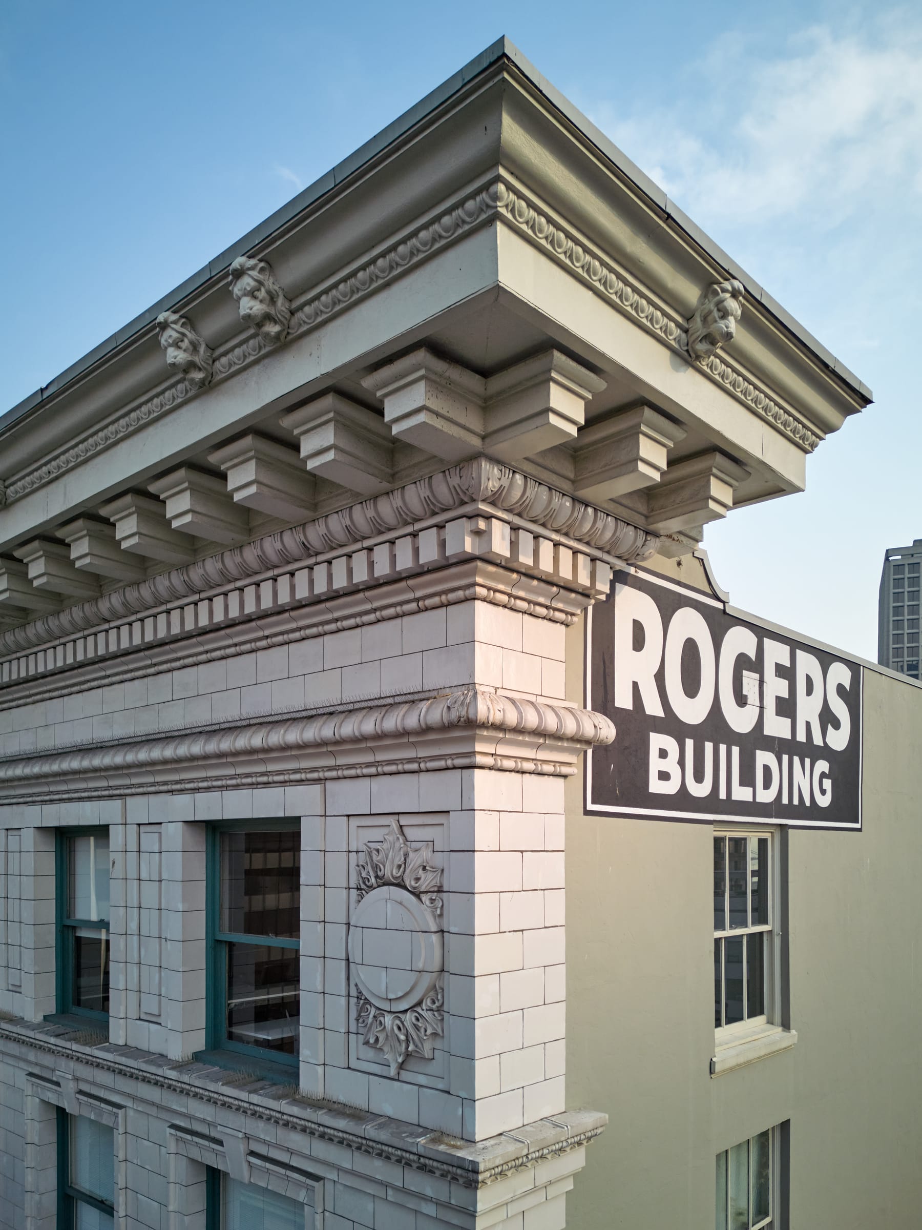
The galvanized steel cornice of the Rogers Building with lion heads and dentils
The steel cornice: lions, dentils, and egg-and-dart, ten storeys above the sidewalk. Photo: Martin Knowles Photo Media.

Base · Shaft · Capital

A façade composed like a column.

Capital
10th floor
The Cornice

A light classical crown of galvanized steel — dentils, egg-and-dart, and lion heads.

Shaft
Floors 2–9
The Terracotta Shaft

Eight plainer storeys of cream glazed terracotta, the vertical body of the building.

Base
Ground floor
The Granite Base

An elaborate ground floor of rose granite Ionic columns and the carved name.

Look Closely

The detail decoder.

Select a feature of the building to read it the way a conservator does.

Carved terracotta frieze reading 1911 · ROGERS · BVILDING · 1911 above the entrance

Read the Façade

The Inscription

Over the entrance, the name is carved the Roman way: 1911 · ROGERS · BVILDING · 1911, with a V standing in for U and interpuncts between the words. It is signature, date stamp, and typography lesson in one.

Look Closely

Notice how the letters are cut into the glazed terracotta blocks themselves — the name is not applied to the building; it is part of the skin.

Follow the Light

The plan is a horseshoe wrapped around daylight.

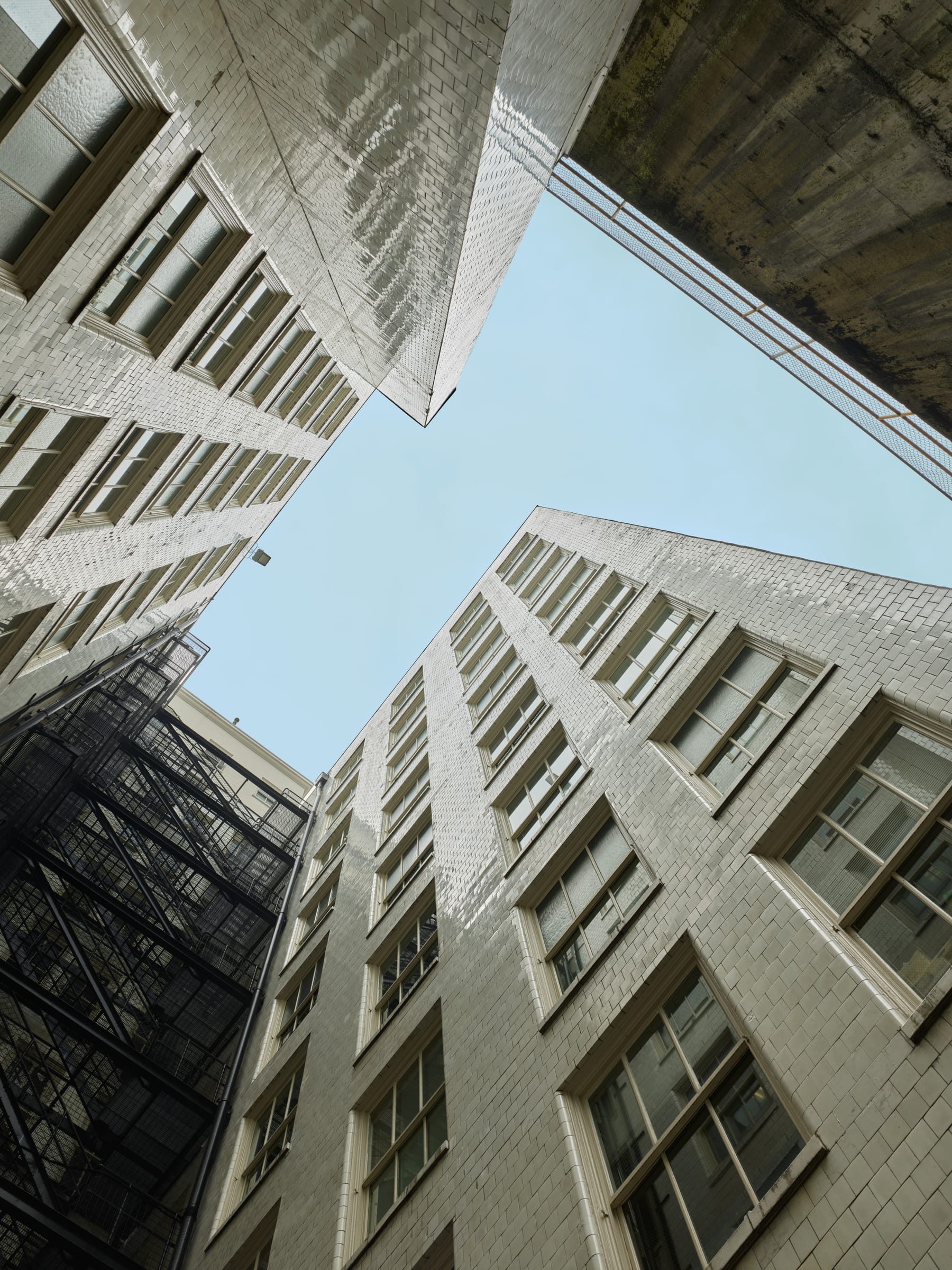
Before electric light was cheap and bright, daylight was infrastructure. Gould & Champney cut a 24-foot well into the plan so that all of the building’s roughly 342 offices had a window on the sky. Air was washed through falling water — cooled in summer, warmed by steam in winter.

Looking straight up the Rogers Building light well at the sky
The well of light: the sky every office was designed to see.
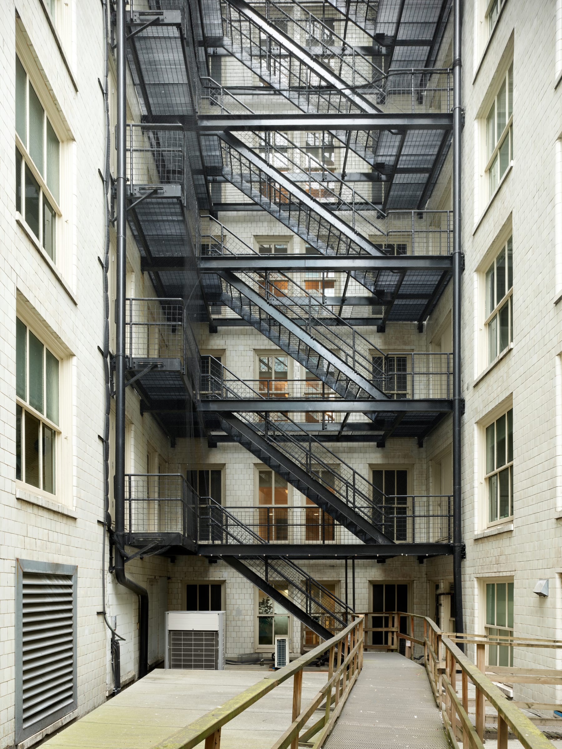
Black fire escapes zigzagging up the glazed brick light well
Iron in the well: fire escapes against glazed brick chosen to bounce light downward.
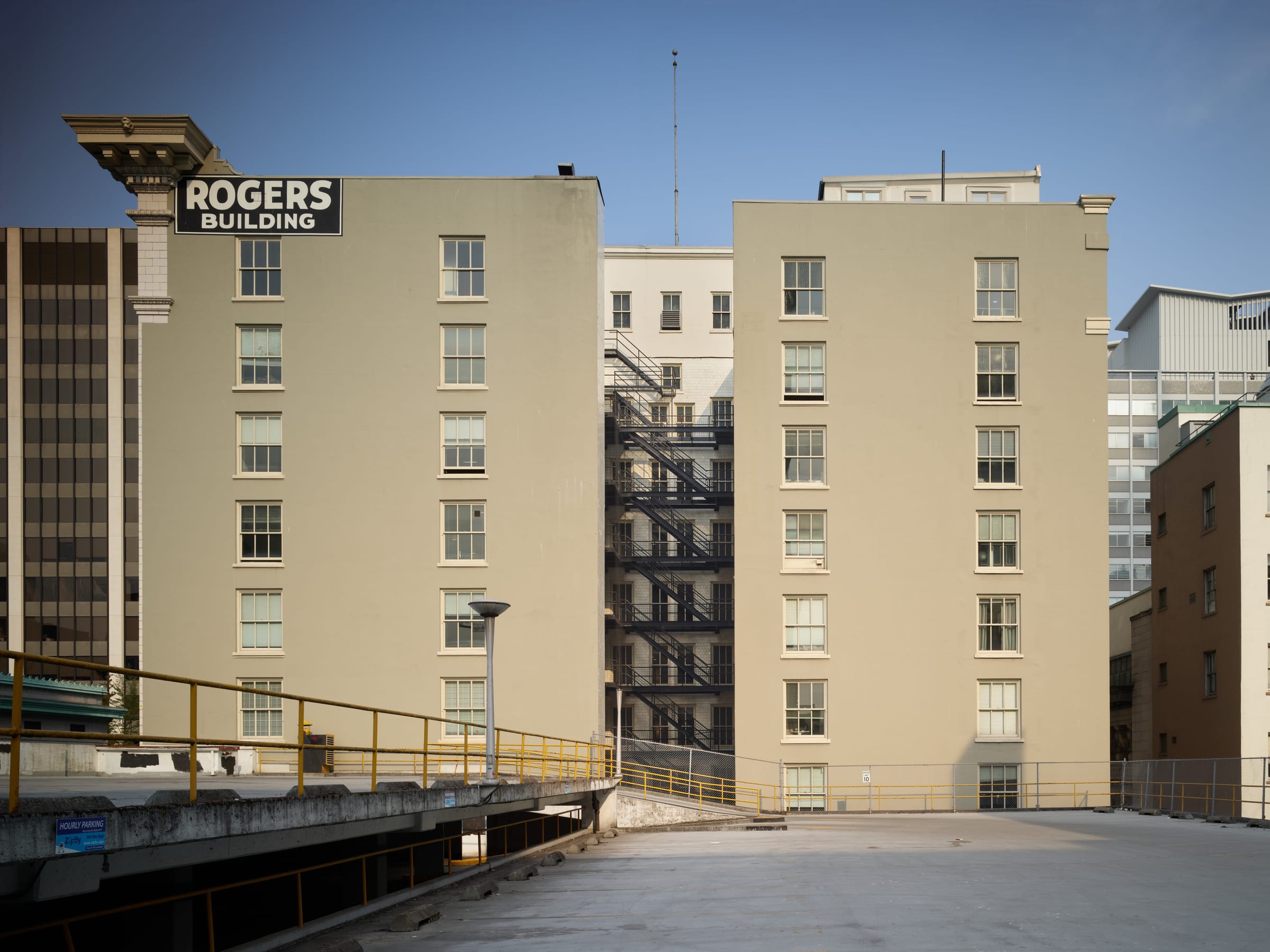
Rear elevation of the Rogers Building showing the two wings of its U-shaped plan
From the lane, the horseshoe reveals itself: two wings, one well, and the painted name. See the animated plan on the home page.

Step Inside

Marble, brass, oak — and a ceiling of gold.

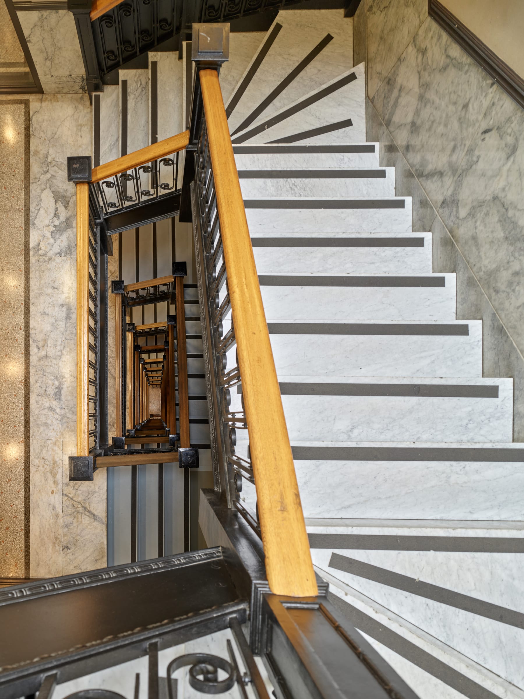
Two original stairways of white Italian marble survive, with polished brass rails, leading from Granville Street to the businesses below.

Looking down the original marble stairwell with black iron balustrade and oak handrail
The stairwell: Italian marble, ornamental iron from Minneapolis and St. Paul, an oak handrail.
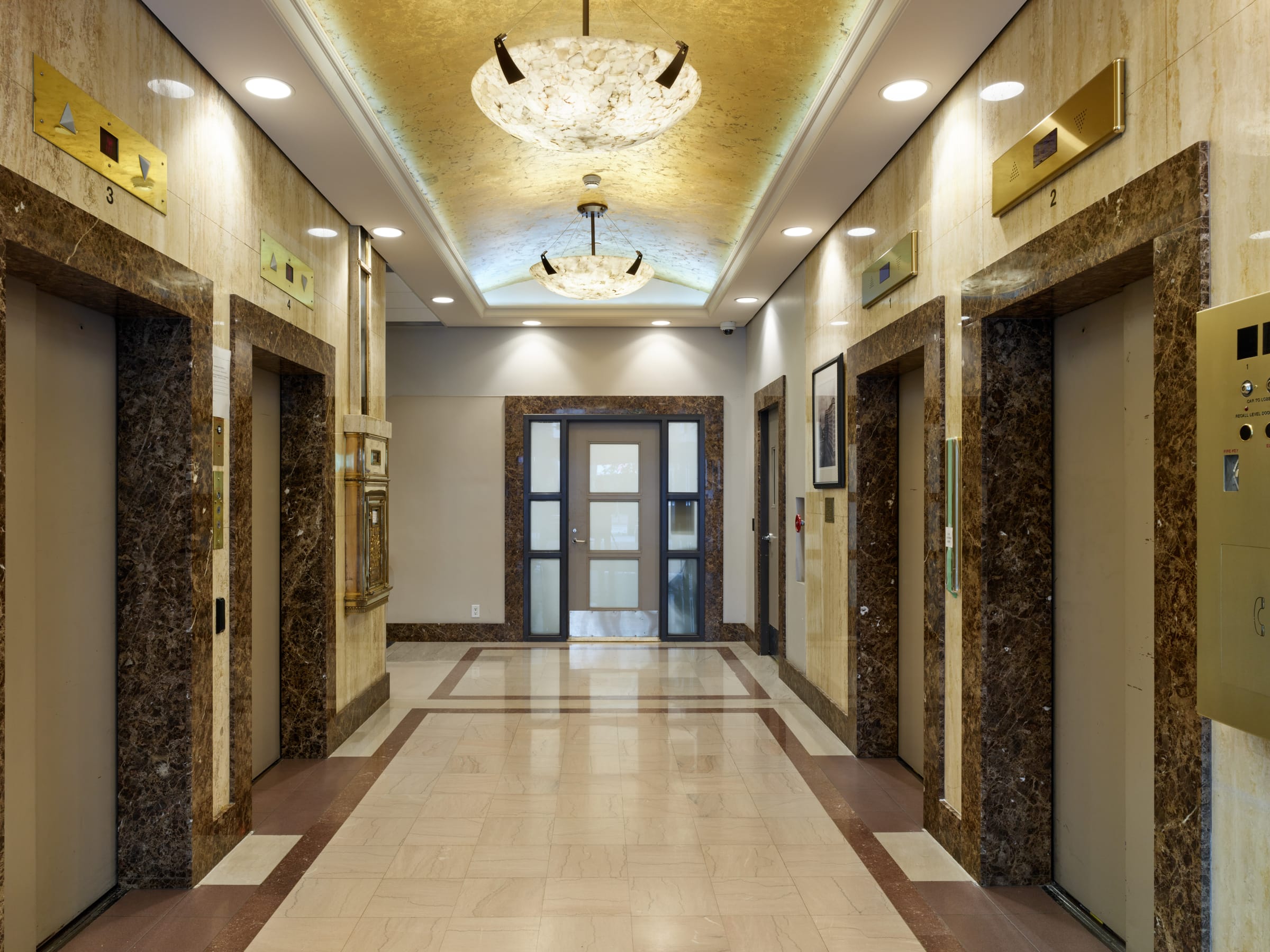
The elevator lobby with gold-leaf vaulted ceiling and alabaster pendants
The gold-leaf elevator lobby: arrival as an event.

The building’s systems were as advanced as its finishes: air filtered through falling water — cooled in summer, heated by steam in winter — two 150-horsepower Babcock & Wilcox boilers, and five Otis-Fensom elevators with a “flash-light indicator” showing car positions. Amenities included a full basement cafeteria, a barbershop, and dedicated women’s facilities with tea service and an attendant.

Material Stories

Seven materials, one argument.

Every material in the building makes the same case: this city is permanent. To trace where each one travelled from, follow the Materials Atlas on the Boomtown Vancouver page.

Glazed Terracotta

The entire upper façade — and the carved inscription over the door

Moulded in Chicago and shipped in fifteen carloads, glazed terracotta could be cast into rich detail and gave the building a refined, self-washing skin.

A boomtown could order a landmark’s worth of ornament from a catalogue two thousand miles away — and afford to.

Conservation Glaze crazing and joint failure let water in; terracotta needs regular inspection and skilled repair.

Granite

The monumental Ionic columns and pilasters at the ground floor

Rose-grey granite from Aberdeen, Scotland — an ocean’s journey to hold up a doorway, and a statement that this corner was permanent.

Vancouver’s trade routes ran everywhere the Empire’s ships did.

Conservation Granite is nearly immortal, but its joints, fixings, and adjacent paving need care.

Marble

The hallways and two surviving stairways; further marbles at the ground floor

White Italian marble — with stone from Alaska, Vermont, and Tennessee — made the interiors cool, permanent, and public-facing.

Prestige in 1912 was measured in materials polished daily by thousands of hands.

Conservation A century of footsteps wears treads hollow; worn marble is repaired, not replaced, to keep the record of use.

Bronze

The entrance doors on Granville Street

Solid bronze doors cost $2,500 in 1912 — the price of a house, spent on a threshold.

The entrance was the handshake of a commercial building; Rogers made it unforgettable.

Conservation Bronze wants patina, not polish-throughs: conservation means gentle, consistent care.

Iron & Steel

Stair balustrades, the fire escapes in the light well, and the cornice

Ornamental iron from Minneapolis and St. Paul dressed the stairs; a galvanized steel cornice with lions and dentils crowned the building without crushing weight.

Steel made both the height and the crown possible — structure and theatre from the same material.

Conservation Coatings fail invisibly; iron and steel need paint systems renewed before rust blooms.

Gold Leaf

The vaulted ceiling of the elevator lobby

Gold leaf turned the everyday act of waiting for an elevator into an event.

Even circulation space was designed to declare confidence.

Conservation Gilding is fragile; cleaning and re-leafing are specialist crafts.

Light

The 24-foot well at the heart of the horseshoe plan

Before cheap, bright electric lighting, daylight was infrastructure: the U-shaped plan gave every one of ~342 offices a window on the sky.

The most important material in the building cost nothing — and shaped everything.

Conservation Protecting the light well means resisting the temptation to fill it in.

Look Up

Edwardian Commercial architecture in Vancouver.

The Rogers Building belongs to the family of glazed terracotta office buildings that gave early Vancouver its first skyline: steel-and-concrete frames dressed in classical ornament, built in the five furious years before the First World War. From the sidewalk at Granville and Pender you can still read the whole grammar — granite base, terracotta shaft, steel cornice — and the carved name that dates it twice: 1911 · ROGERS · BVILDING · 1911.